MyFitnessPal Redesign
- alliehe
- Jan 27, 2025
- 3 min read

Updated: Apr 9, 2025
Case Study/Redesign
December 2023 – January 2024
Deliverables: App Redesign Prototype
Individual Project
Project Overview
Despite being one of the most popular fitness and nutrition tracking apps, MyFitnessPal has faced increasing user frustration due to a complex user interface, excessive ads, limited personalization, and missing key features such as barcode scanning. Many users struggle with navigation, customization, and engagement, leading to reduced user retention and lower satisfaction.
The MyFitnessPal UX Redesign project aimed to enhance the app’s usability, personalization, and engagement while addressing pain points identified through extensive user research. The redesign introduces:
A streamlined and intuitive UI for effortless navigation.
AI-powered customization for personalized fitness and meal plans.
Enhanced social features to increase user motivation and accountability.
Improved tracking functionalities, including a revamped barcode scanner and macro tracking.
Reduced ad intrusiveness to create a smoother user experience.
By modernizing MyFitnessPal’s design and focusing on user needs, this project provides a more intuitive, engaging, and effective fitness-tracking experience.
Prototype Link:
My Contributions
Role: UX Designer / Researcher
Conducted competitive analysis of fitness tracking apps such as Lose It!, Cronometer, and Lifesum. And conducted user resrach through surveys.
Designed a high-fidelity prototype in Figma, implementing a cleaner, more intuitive layout.
Conducted usability testing, refining the prototype based on user feedback.
The Problem
Complex UI & Poor Navigation – Users find MyFitnessPal’s interface cluttered and difficult to navigate.
Lack of Customization – The app does not offer personalized recommendations for meal and workout plans
Ad Overload – Frequent, intrusive ads negatively impact user experience.
Missing Key Features – Users miss the barcode scanner, struggle with limited food memory, and desire better tracking features.
Low Social Engagement – The app lacks community-driven motivation, making it harder for users to stay accountable.


The Solution
The MyFitnessPal UX Redesign introduces new features and improvements to make fitness tracking simpler, smarter, and more engaging:
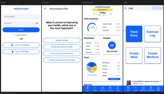
Improved UI & Navigation
Redesigned dashboard that highlights key features like calorie tracking and exercise logging.
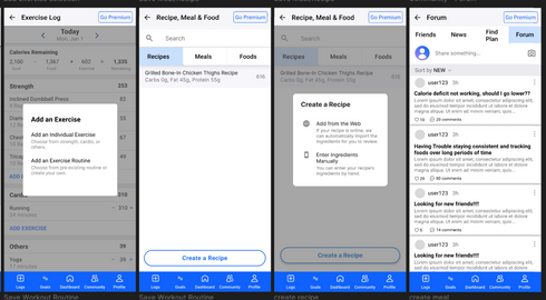
Simplified meal logging with quick add, barcode scanning, and recent foods list.
Enhanced Tracking & Monitoring
Revamped barcode scanner for fast food logging.
New macro and PR (personal record) trackers for advanced goal setting.
Heart rate and step tracking integration for better fitness monitoring.
Stronger Social Features
Friend activity feed for sharing workouts and meals.
Motivational streaks and badges to encourage consistency.
Gym buddy finder to connect users based on location and fitness goals.
Reduced Ad Disruptions
Smarter ad placements to maintain monetization while reducing user frustration.
Premium ad-free option for an uninterrupted experience.
AI-Powered Customization
AI-generated meal & workout plans based on a user’s goals, dietary needs, and fitness level.
Smart goal tracking with adaptive progress updates.
The Process
User Research & Insights
Survey responses and Reddit discussions helped uncover key user frustrations:
60% of users struggled with UI complexity.
Over 50% found ad intrusiveness a major issue.
Users wanted better food tracking, personalized plans, and social engagement.
Personas & User Scenarios
Developed three key personas based on user research:
👩💼 Sarah (Busy Professional): Needs a fast and efficient meal/workout tracker.
🏋️ Alex (Fitness Enthusiast): Wants detailed analytics, client tracking, and minimal ads.
👴 Jose (Health-Conscious Senior): Prefers simple navigation, large fonts, and heart health tracking.
Competitive Analysis
Compared MyFitnessPal against Lose It!, Cronometer, Lifesum, and SmartCoach AI:
Lose It! excels in photo-based meal logging.
Cronometer offers detailed macro tracking.
Lifesum provides customized diet plans.
SmartCoach AI leverages AI-driven fitness coaching.
Key Takeaway: MyFitnessPal needed a more streamlined UI, stronger AI customization, and enhanced social features.
Wireframing & Prototyping
Created low-fidelity wireframes and high-fidelity prototypes in Figma, focusing on:
Simplified dashboard layout with quick access to key features.
Personalized onboarding process using AI recommendations.
Stronger social integration with newsfeeds, streaks, and shared progress.


Usability Testing & Iteration
Tested the prototype with 10 users, refining based on feedback:
Users found the UI easier to navigate → Improved button placement and menu clarity to be way more intuitive for navigation
Barcode scanner was a highly requested feature → Ensured seamless food logging.
Users loved the new social features → Strengthened community and streak tracking.
Results
📈 Improved user satisfaction – 85% of testers preferred the redesigned UI over the original.🎯 Higher engagement potential – Social features and AI coaching received positive feedback.
Ideas for future development – Can be expanded to include AR meal logging & deeper AI insights.
This project successfully modernized MyFitnessPal, making it simpler, smarter, and more user-friendly, while addressing long-standing user frustrations.


Comments